The word ‘Reinvention’ came up in conversation around our office recently as we navigate an increasingly changing and complex world of trends and societal shifts. To provide some clear examples of the ways reinvention is impacting different industries and future direction as a whole, our team put together thoughts and observations from each of our viewpoints.
Here are a few of our insights as we navigate reinvention, together:
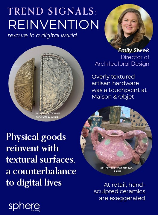
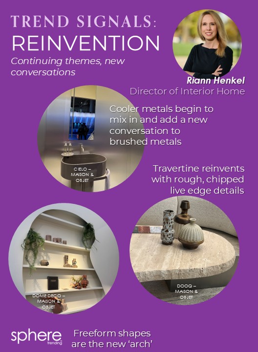
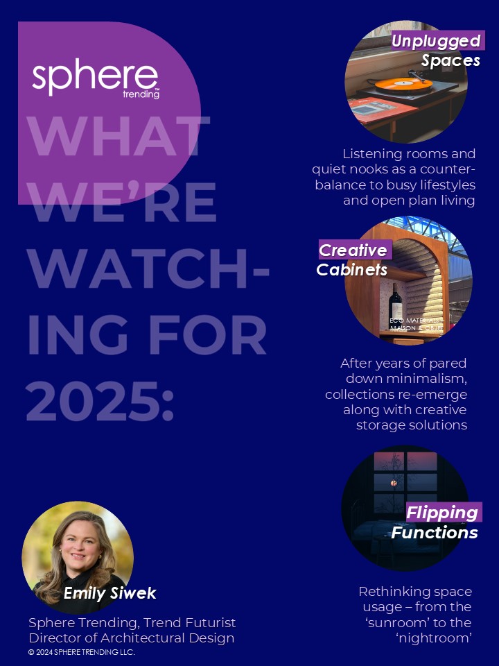
By Emily Siwek, Sphere Trending Trend Futurist, Director of Architectural Design
For our final post of 2024, we wanted to share a bit about what our team has an eye on for the coming year. We hope you enjoy a peek into our perspectives.
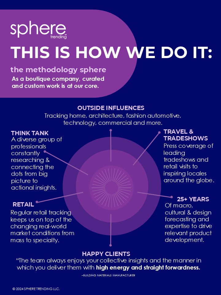
Our Methods
First, here’s a snapshot of how our team combines trendspotting, research, and collective thought to stay on top of the coming trends.
Our Perspectives
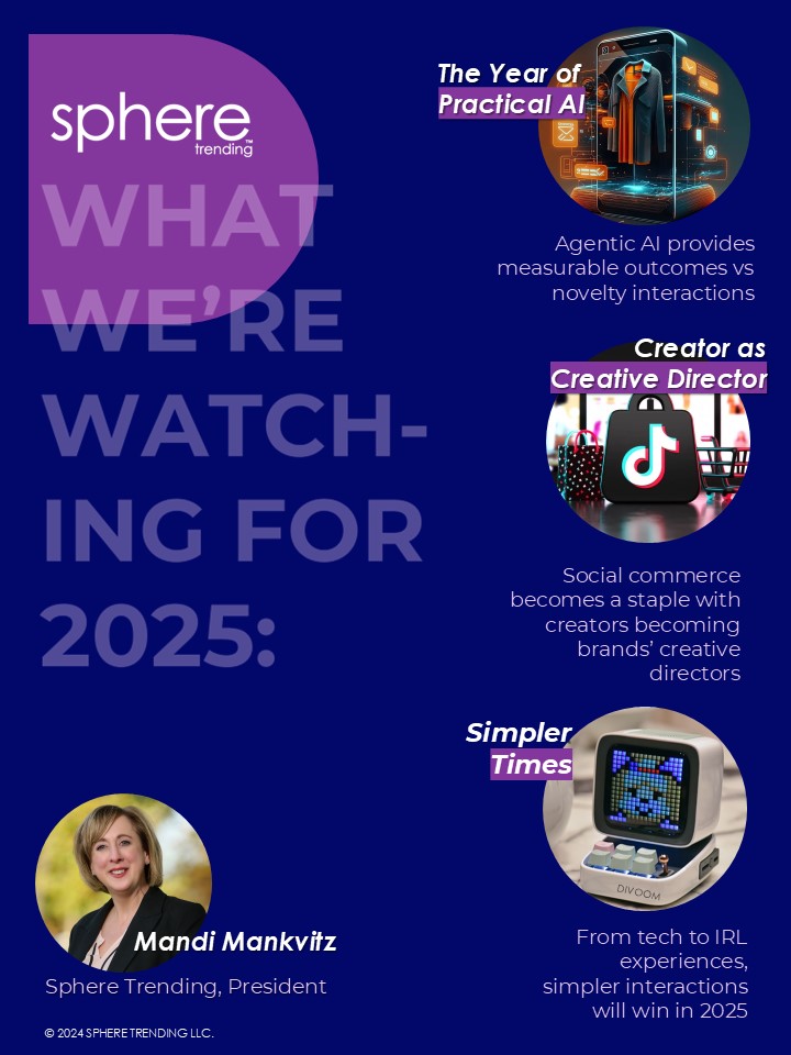
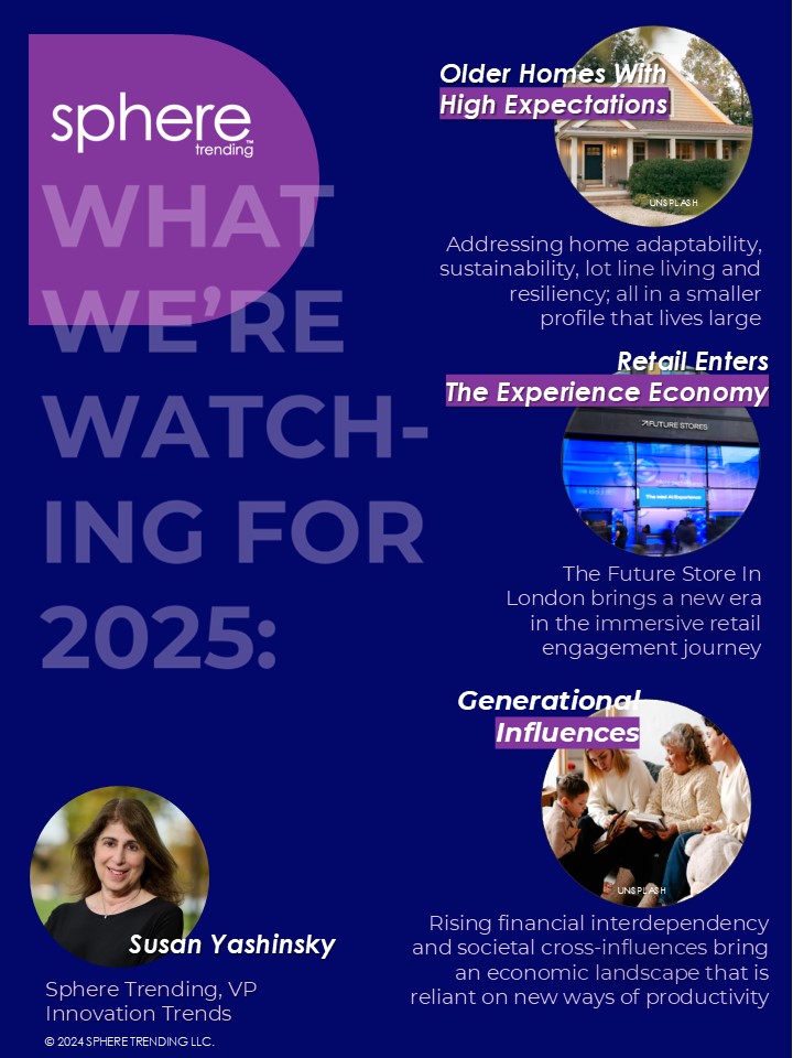
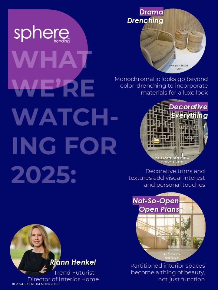
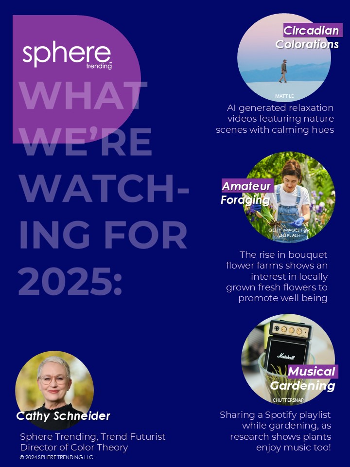
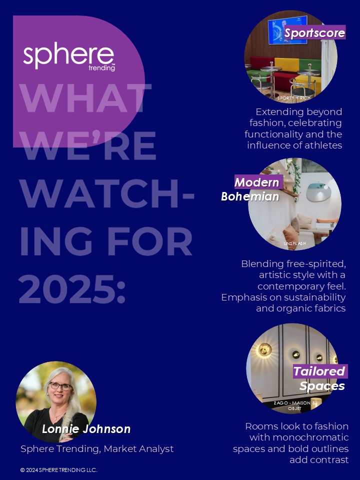
We’re happy to share with a glimpse into our team here at Sphere and some of the new things we’re predicting for 2025.
Excited to stay ahead of trends in 2025? Contact us for a complimentary20-minute trend discussion at info@spheretrending.com. Happy New Year!
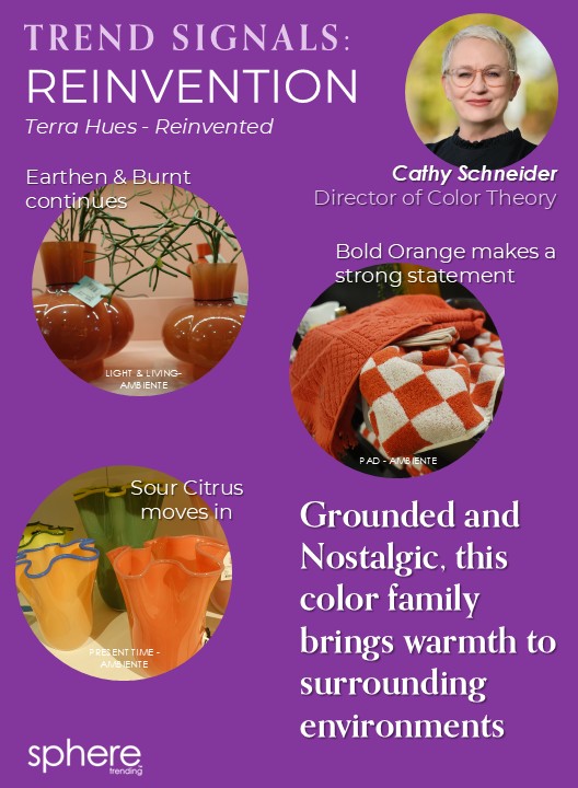
By Cathy Schneider, Sphere Trending Trend Futurist, Director of Color Theory
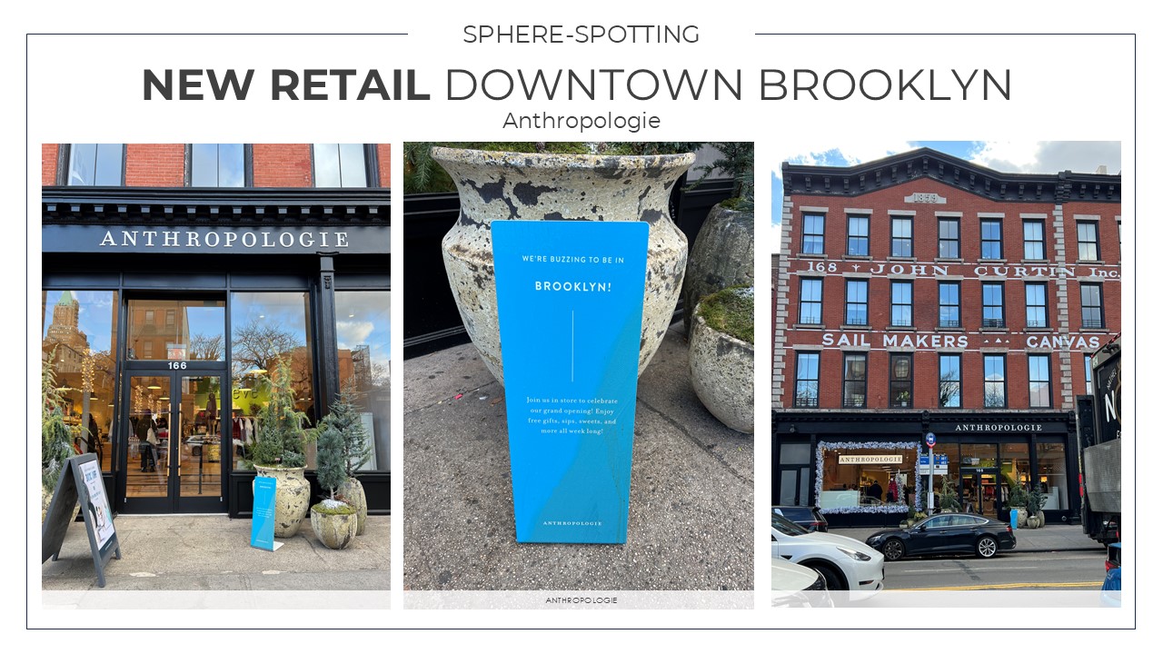
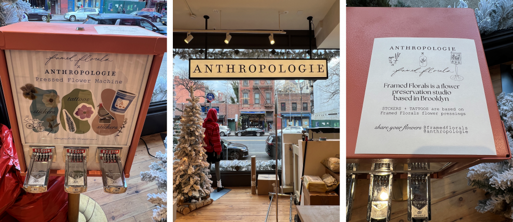
Surrounded by the spirited shops and restaurants on Atlantic Ave, this Anthropologie store, the very first one in Brooklyn, sits in a two-story landmarked brick and metal building from 1856, once the site of John Curtin Inc. Sail Makers and Canvas Goods.
What Makes This Store Unique?
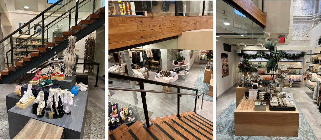
Other than being the first Anthropologie in Brooklyn, it features a shoe shop, candle shop, and in-store exclusive NYC products.
Anthropologie Brooklyn
Framed Florals is a Brooklyn based preservation studio that creatively presses, preserves, & frames flowers. You can purchase in the store, from the pressed flower machine, stickers and tattoos based on Framed Florals flower pressings.
By Cathy Schneider, Sphere Trending Trend Futurist, Director of Color Theory
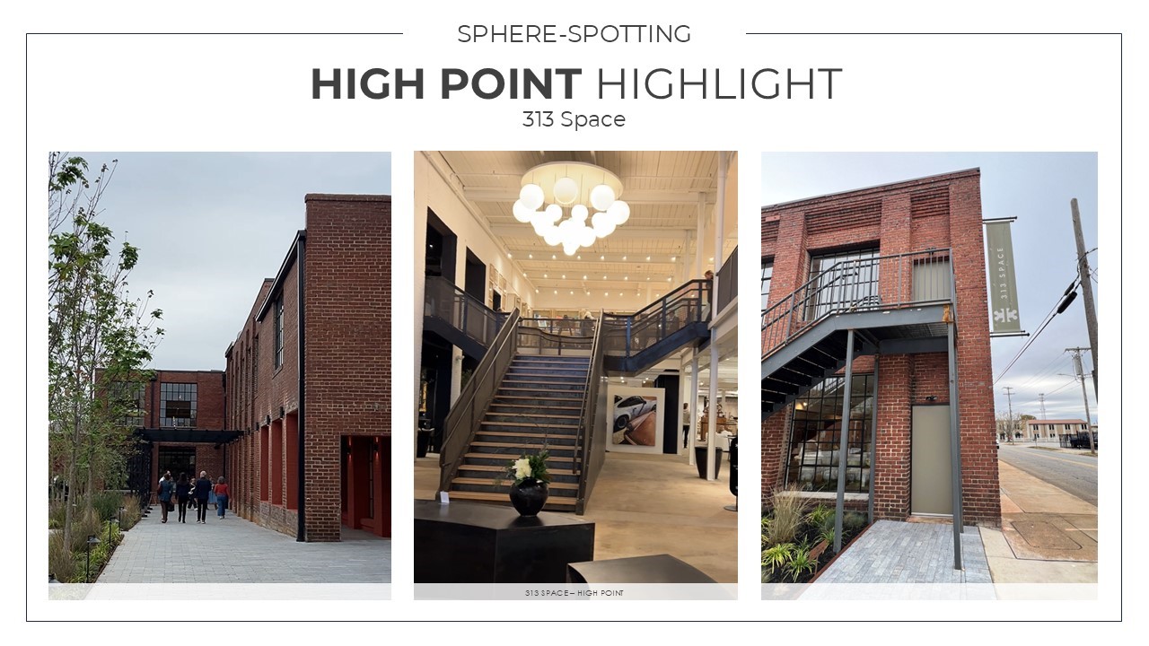
313 Space is a new, curated market experience located in a historically restored 155,000 sq ft 20th century mill in High Point, NC. The original red brick building was built in 1901 for The High Point Buggy Co and later became the home of the Slane Hosiery Mill. This state-of-the-art facility offers modern showrooms with meticulously preserved hardwood floors, tall wooden ceilings and beams, flooded with natural light.
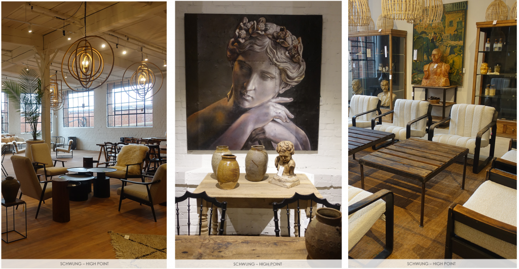
Schwung Home
Schwung, a creative studio with the heart of a collector and the hands of a maker, occupies the majority of the first floor, joined by the new Dedon US Headquarters, both of which are open year-round.
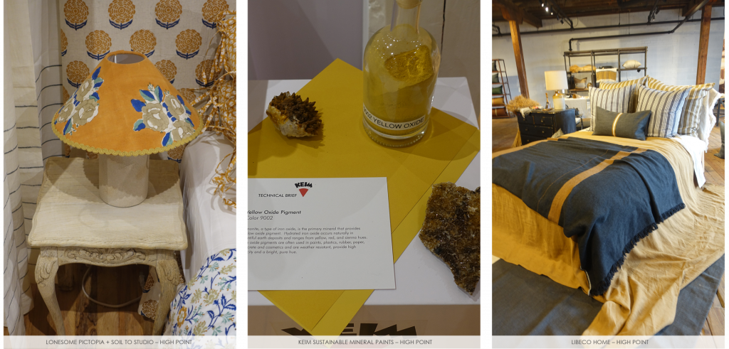
Lonesome Pictopia + Soil to Studio | Keim Sustainable Mineral Paints | Libeco Home
Other products seen at the 313 space included small scale lampshades that were a new product featured at Soil To Studio, a sustainable area featured Keim Sustainable Mineral Paints and Libeco Home, the authentic Belgian Linen Company, had a strong presence at 313 Space as well.
By Cathy Schneider Sphere Trending Trend Futurist, Director of Color Theory
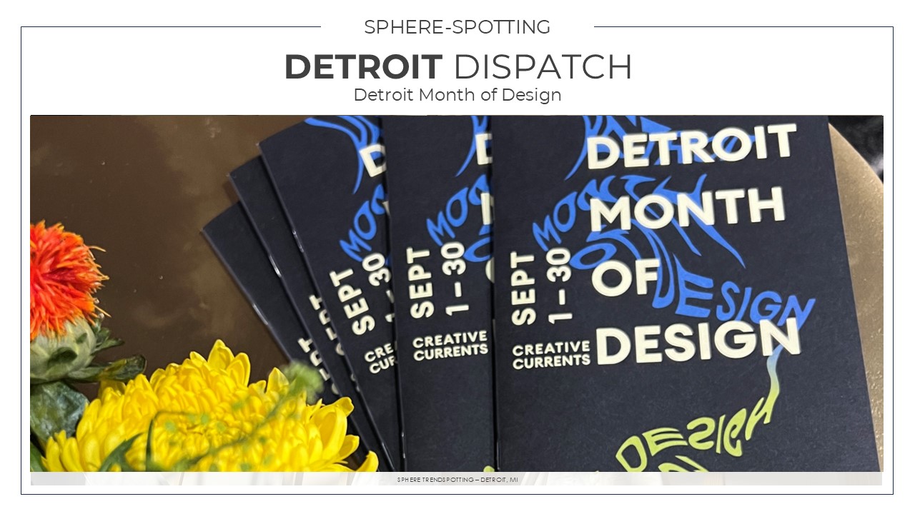
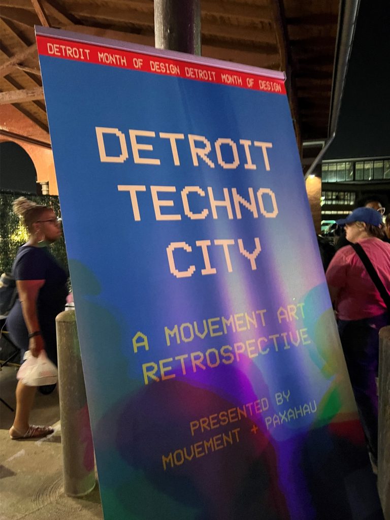
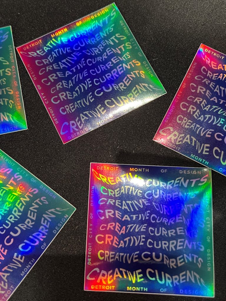
As the first & only Unesco City of Design in the United States, Detroit is a global hub of culture & creativity. Detroit Month of Design is a citywide collaboration of the arts that gathers designers, consumers, residents and the greater community to celebrate Detroit’s role as a national and global design capital. Detroit Month of Design returned for its 14th annual edition this September 1-30, 2024.
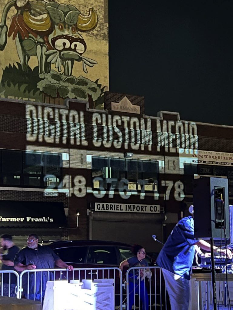
Eastern Market After Dark
Eastern Market After DarkEastern Market After DarkEastern Market After Dark
This year’s Eastern Market After Dark (EMAD) was the signature event of the annual Detroit Month of Design. EMAD showcased an array of talented artists, businesses and musicians, transforming Eastern Market into a hub of live music, open studios, and vibrant galleries. With thousands of people in attendance, it truly showcased the best of Detroit’s design and culture.
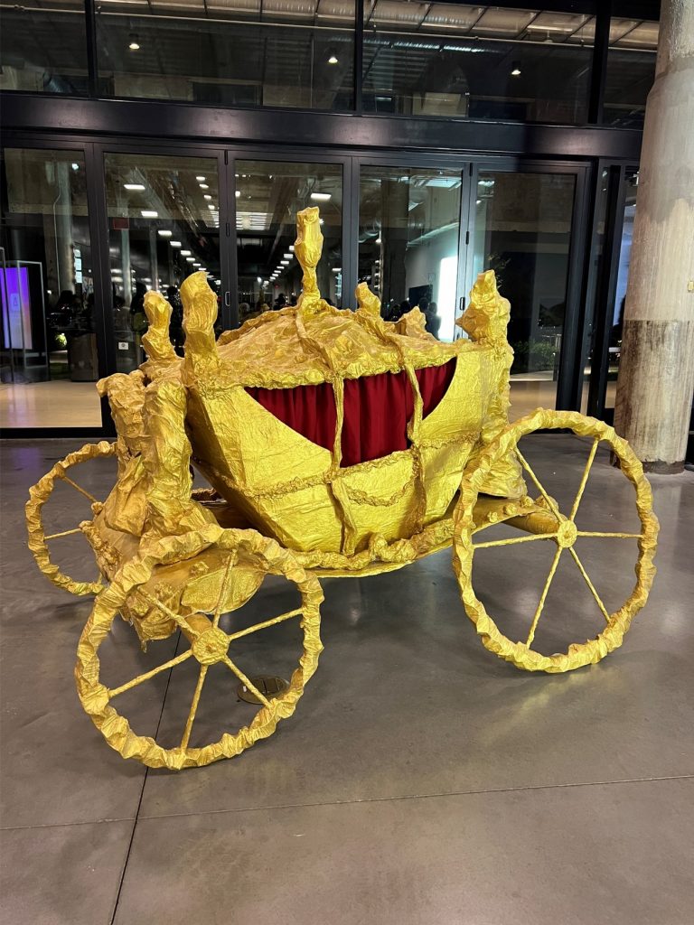
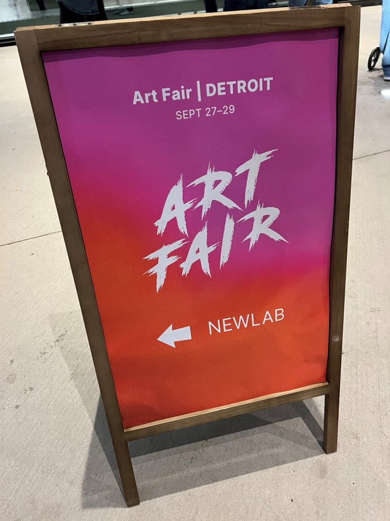
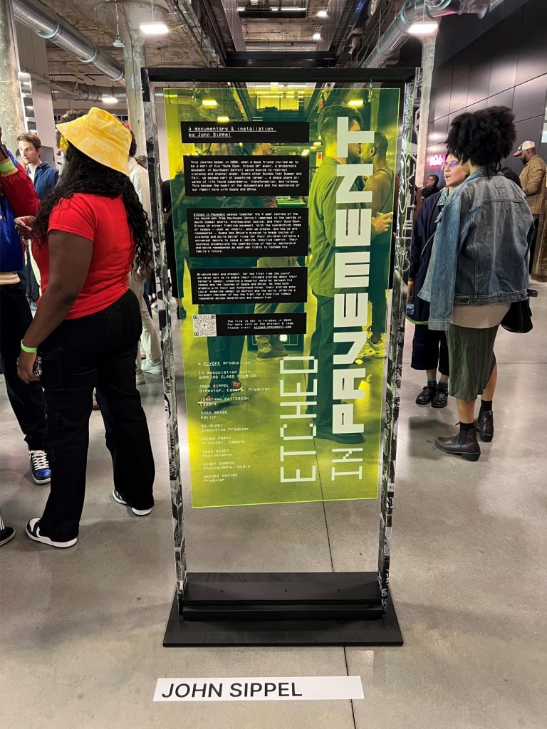
ArtClvb at Newlab
ArtClvb at NewlabArtClvb at NewlabArtClvb at Newlab
ArtClvb is a specialized market network created for the art world, combining social networking and marketplace features. Art Fair, Detroit was a three-day event showcasing contemporary, affordable works ranging from emerging to mid-career artists, making it accessible to the general public. The event was a celebration of art, culture, and community, offering diverse programming designed to enrich and inspire. Our team made it over to the location at NewLab next to Michigan Central. Featured artwork included “Gold State Coach’ by Mary-Ann Monforton and ‘Etched in Pavement’ a documentary and installation by John Sippel.
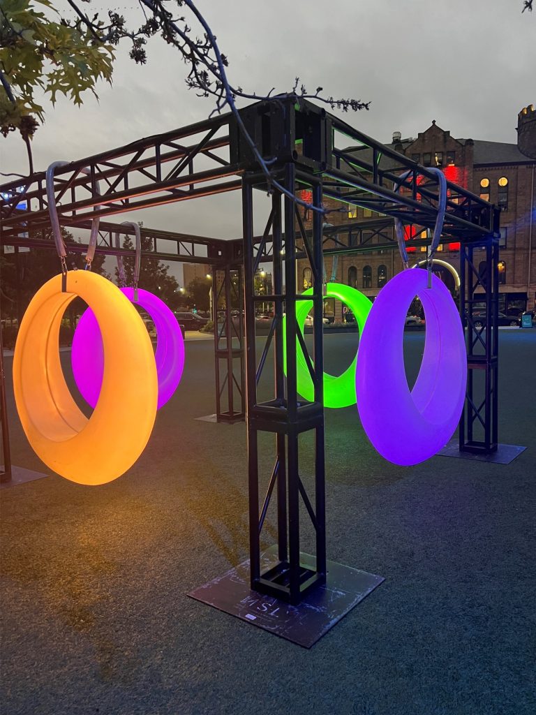
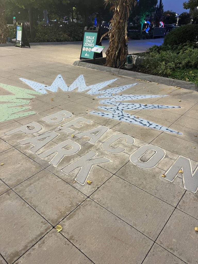
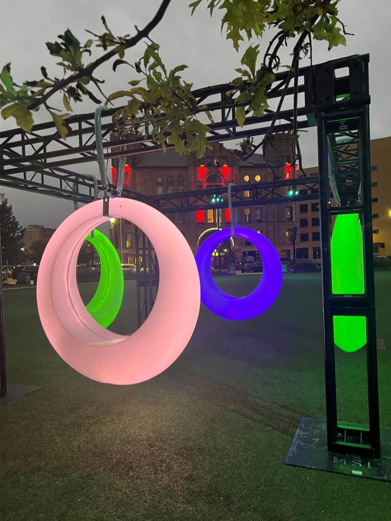
Glow & Swing at Beacon Park
One of a kind LED swings lit up Beacon Park in a magical way, creating amazing photo opportunities for Design Core Detroit’s Month of Design. The swings appeared to be sleek and modern during the day and evolved into glowing circles of color changing light at night. The illuminating experience was up through October 6th and we are so glad we did not miss out!